Conversion Rate OptimizationEcommerce Growth Through A/B Testing

Problem
Many eCommerce sites lose potential customers due to friction in the user journey—unclear navigation, distracting content, or ineffective page layouts. Even minor UX issues can lead to abandoned carts and lost revenue.Solution
Conversion Rate Optimization (CRO) identifies these pain points through A/B testing, user insights, and data analysis. By making targeted design and functionality improvements, CRO enhances the shopping experience, reduces drop-off rates, and drives measurable revenue growth.
Understanding the impact of CRO is one thing—seeing it in action is another. Below are five real-world A/B tests that showcase the power of strategic experimentation, whether through major wins, valuable learnings from inconclusive tests, or lessons from losses that led to future success.
Sitewide | All DevicesAdd Sticky Email Button
Hypothesis
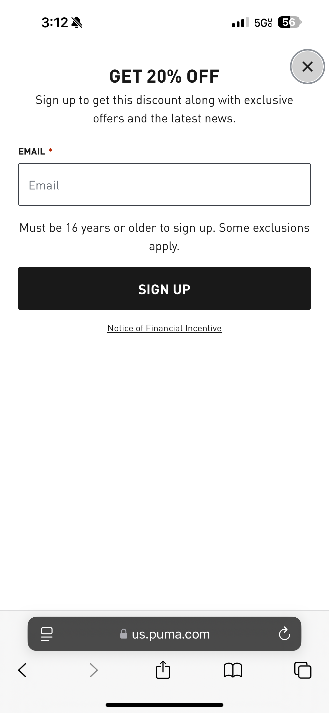
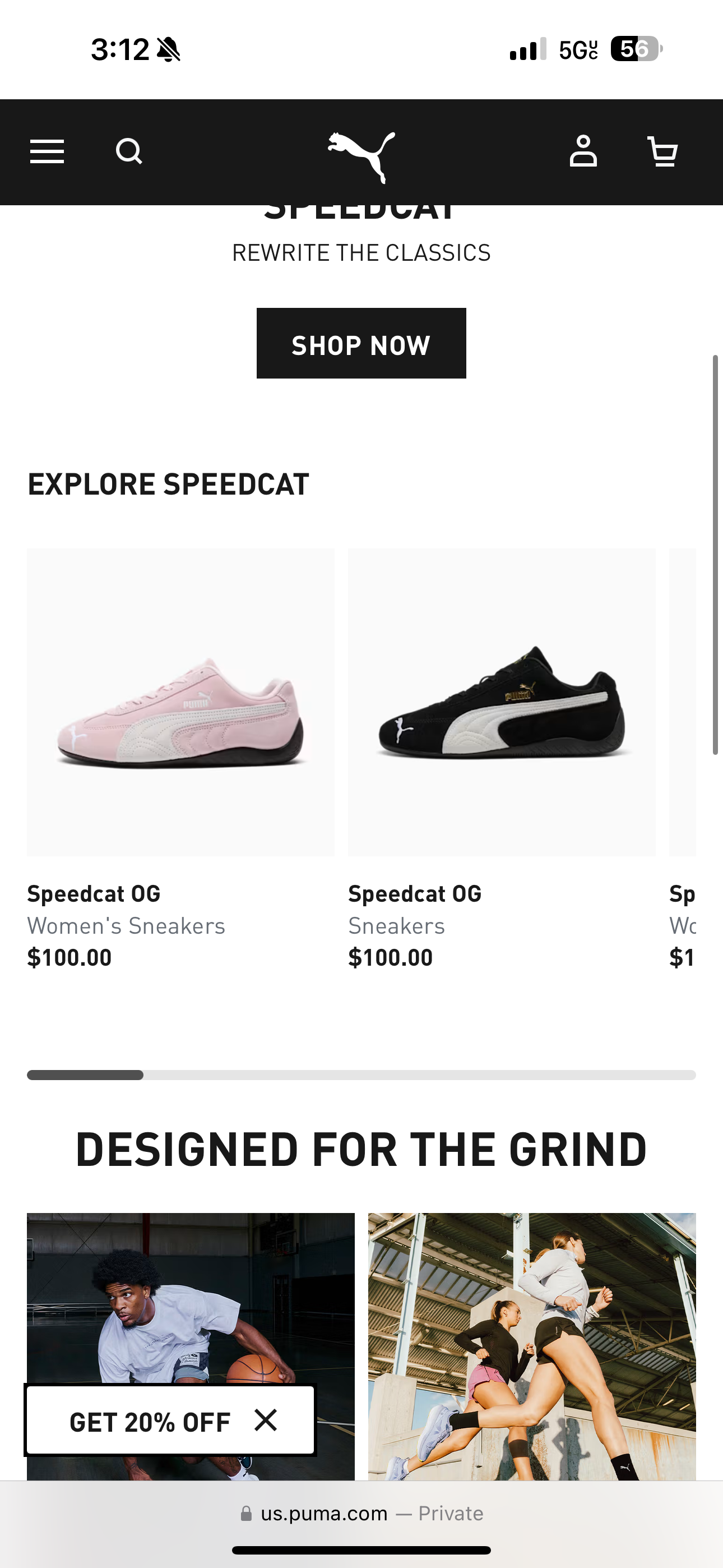
Replacing the email popup modal with a less intrusive sticky button will reduce user friction, allowing them to engage with the promotional message on their terms.Design
Disable the popup and replace it with a sticky button in the bottom left corner labeled 'Get 20% Off'. When clicked, the button will trigger the email popup.Email Signups
-53%
Transactions
+22%
Revenue
+$1MM
Takeaway
This test demonstrates a trade-off between boosting transactions and reducing email engagement. Prioritizing one over the other is a business decision—this client chose to focus on transactions.Control
Variant
Checkout | All DevicesHighlight 'Best Value' Shipping
Hypothesis
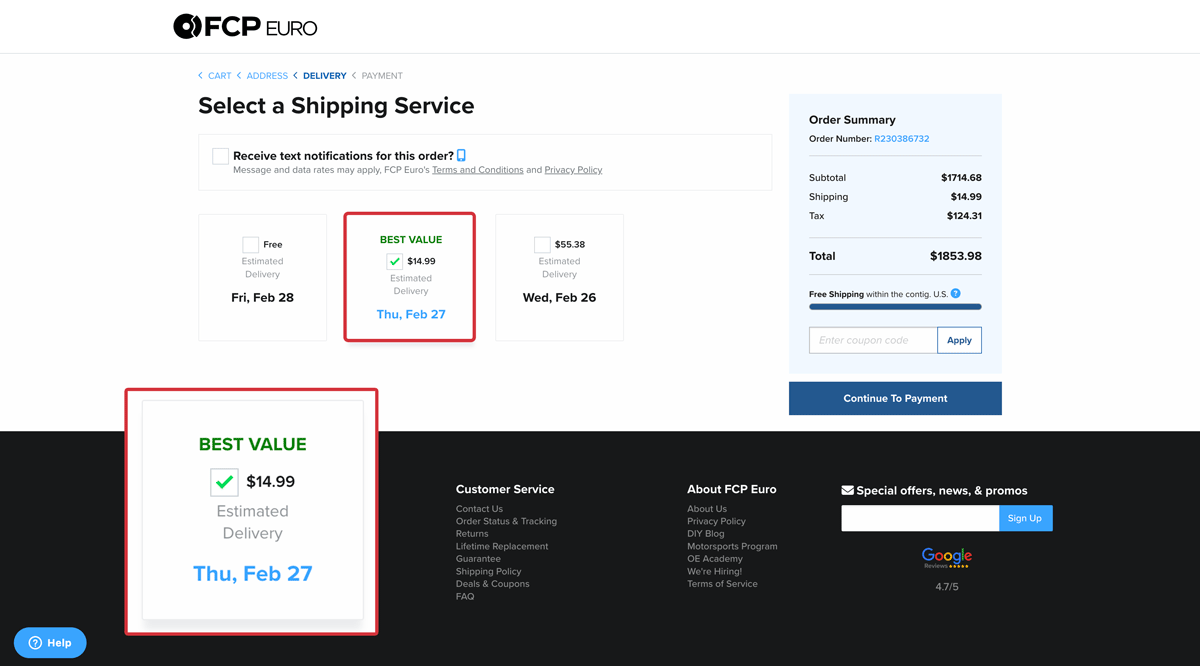
We believe customers often overlook the benefit of faster delivery when free shipping is available. By visually highlighting the best-value shipping option, we aim to draw attention to paid shipping methods and increase their selection.Design
Add a green "Best Value" badge next to the first paid shipping option to draw attention and encourage selection.Transactions
+1%
Paid Shipping
+40%
Revenue
+$120K
Takeaway
Free shipping is often an expected perk for online shoppers, but this test demonstrates that strategically highlighting shipping options can drive greater engagement and influence purchase decisions.Control

Variant
Product Detail Page | All DevicesAdd a Featured Review
Hypothesis
Placing a featured review near the product description will build trust and increase conversions. A ‘Read All Reviews’ button anchors users to the full reviews section.Cart Additions
-4%
Transactions
-6%
Revenue
-5%
Iteration
Insight: Users who clicked ‘Read All Reviews’ were less likely to return and complete their purchase.Solution: Removed the ‘Read All Reviews’ button while keeping the featured review visible.
Cart Additions
0%
Transactions
+1.50%
Revenue
+$98K
Design 1
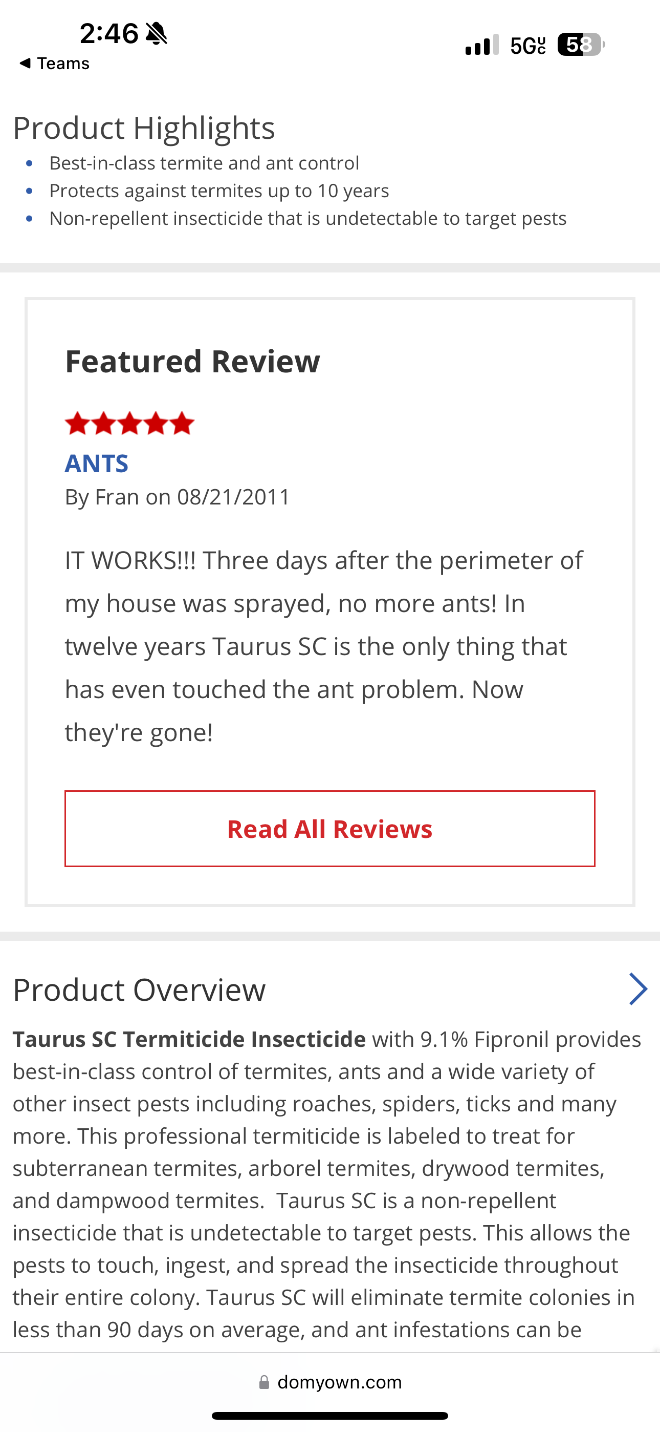
Design 1 Anchor
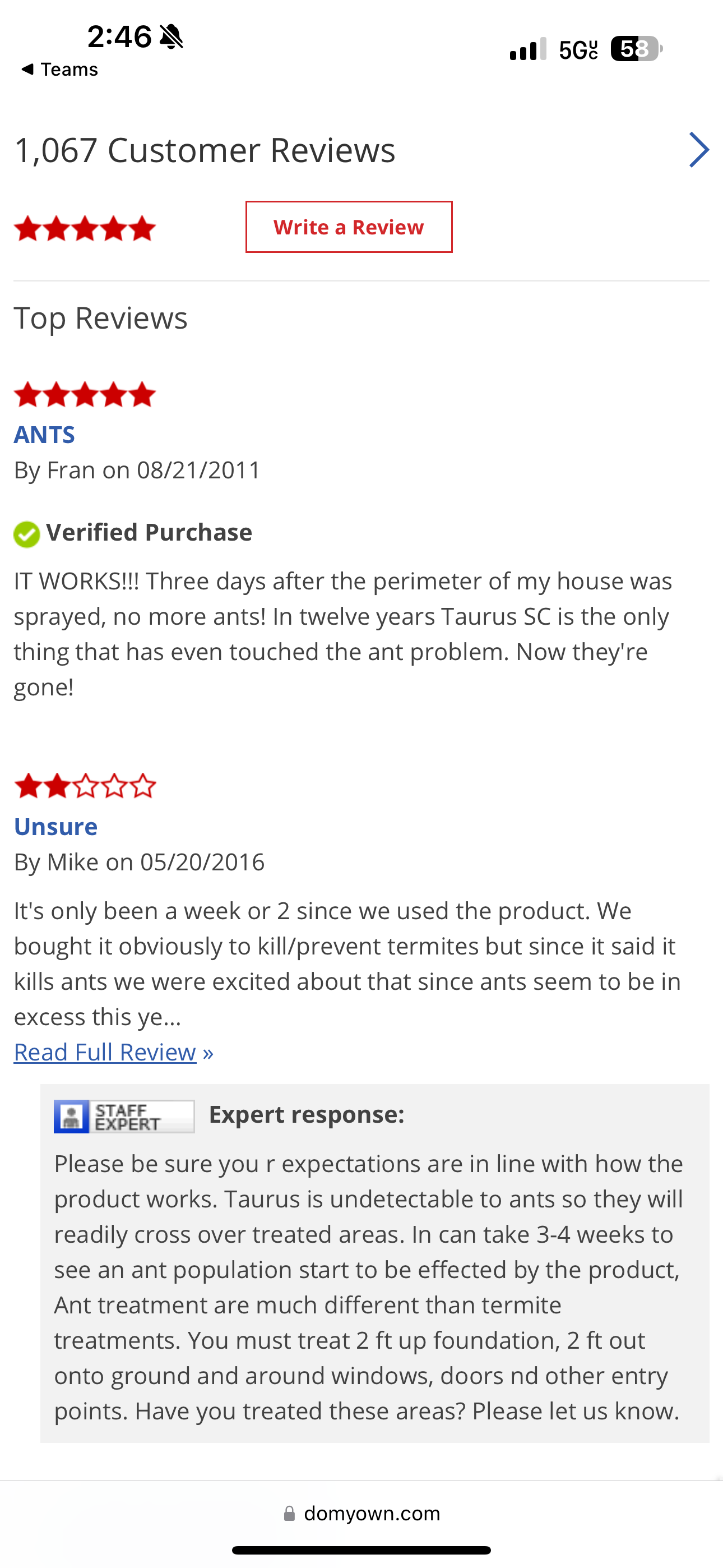
Iteration
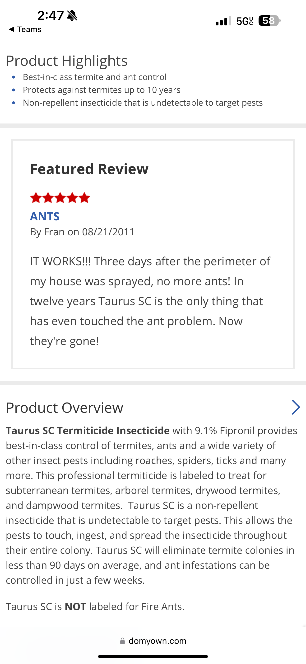
Google Shopping TrafficSimplify Shopping Experience
Hypothesis
Redesigning the product page for shopping ad traffic will better align with user intent. Replacing lower-page content with a product grid similar to a shopping results page will encourage users to continue browsing onsite instead of returning to Google Search.Design
Remove all content below the add-to-cart button and replace it with a six-row product grid showcasing similar items. Title this section 'You May Also Like'.Cart Additions
+60%
Transactions
+49%
Revenue
+$553K
Takeaway
Users who click on a product ad but find it's not the right fit are open to exploring similar products within the same brand when prompted.Variant
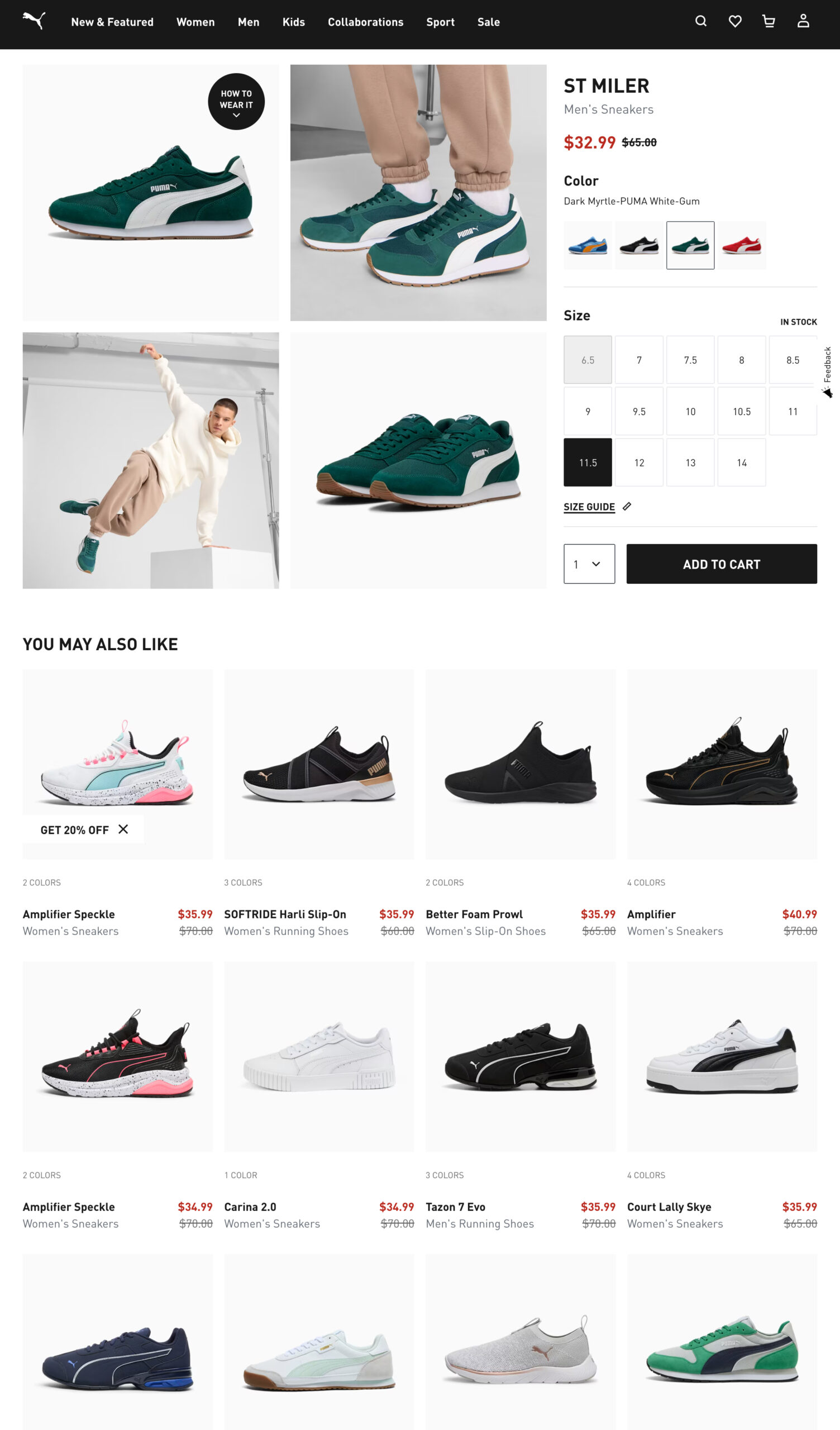
Product Listing Page | All DevicesAdd a 'Check Fit' Label
Hypothesis
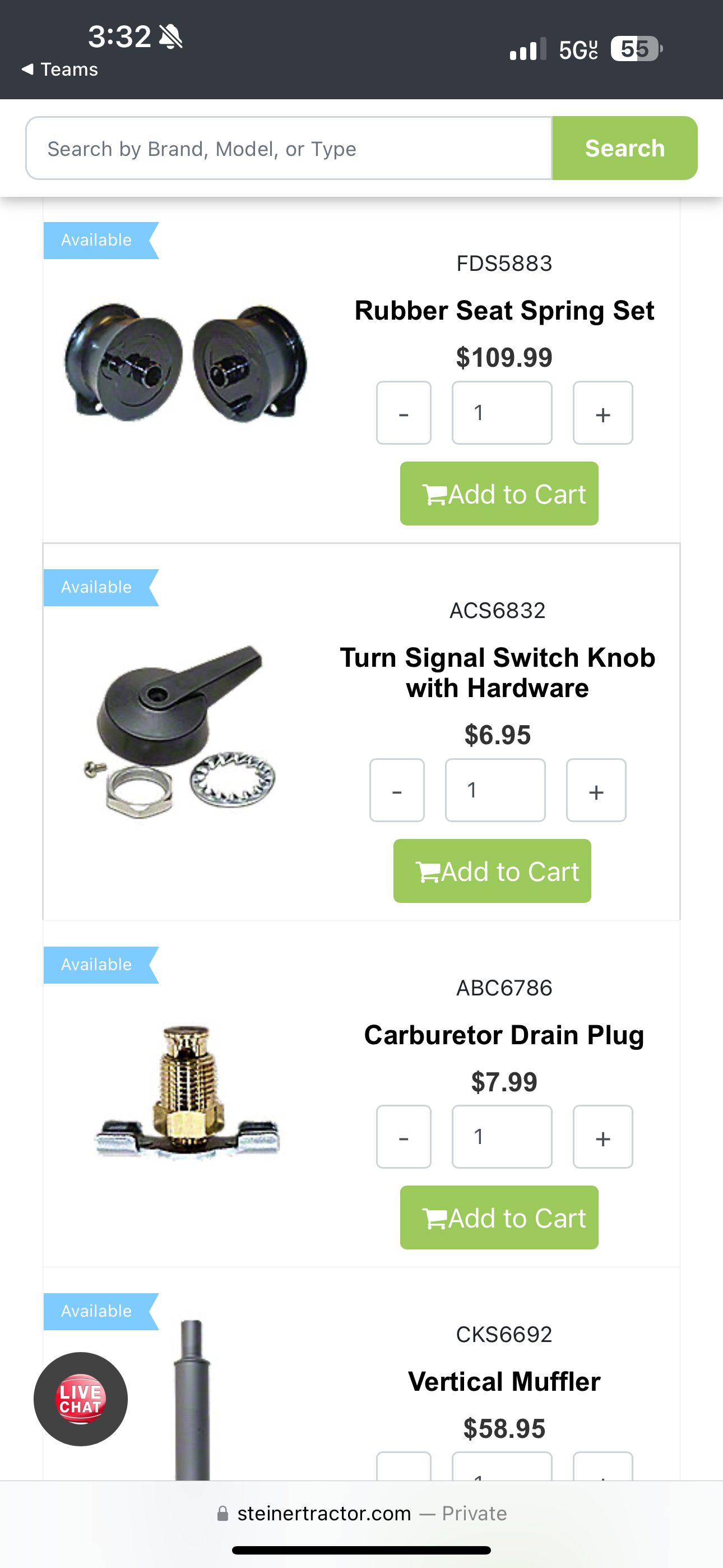
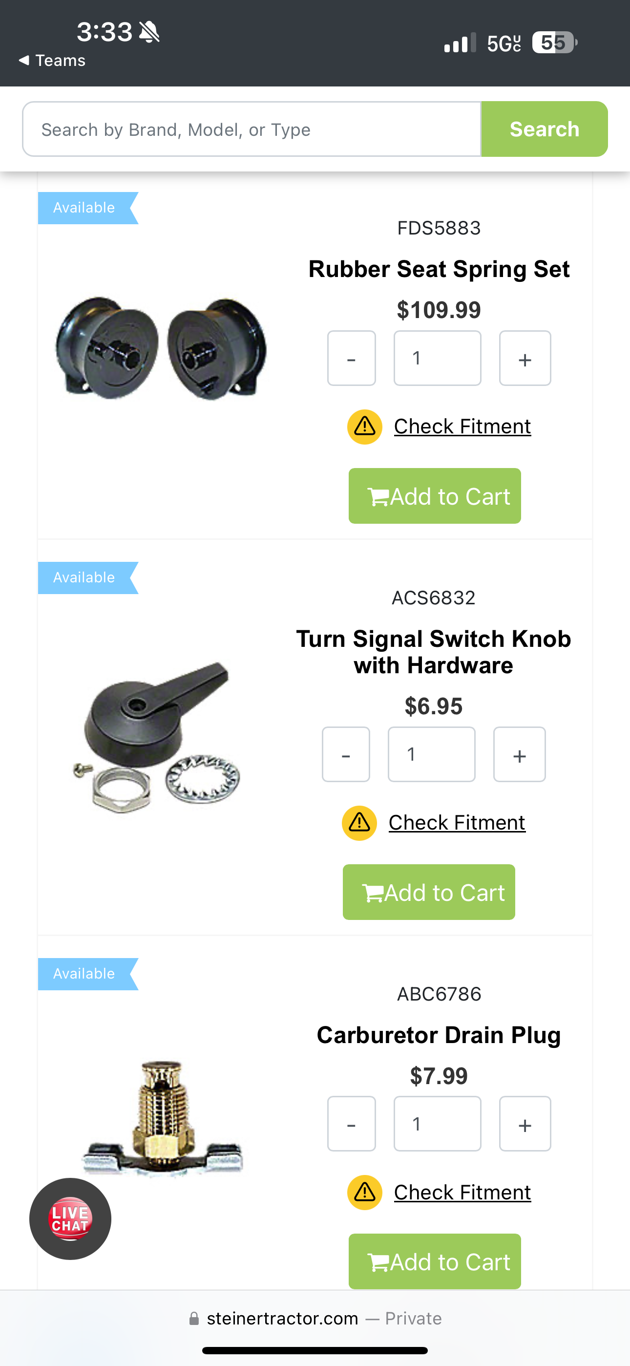
Adding clear fitment messaging to product tiles will help users quickly identify compatible tractor parts, encouraging informed clicks and reducing order returns from incompatible parts.Design
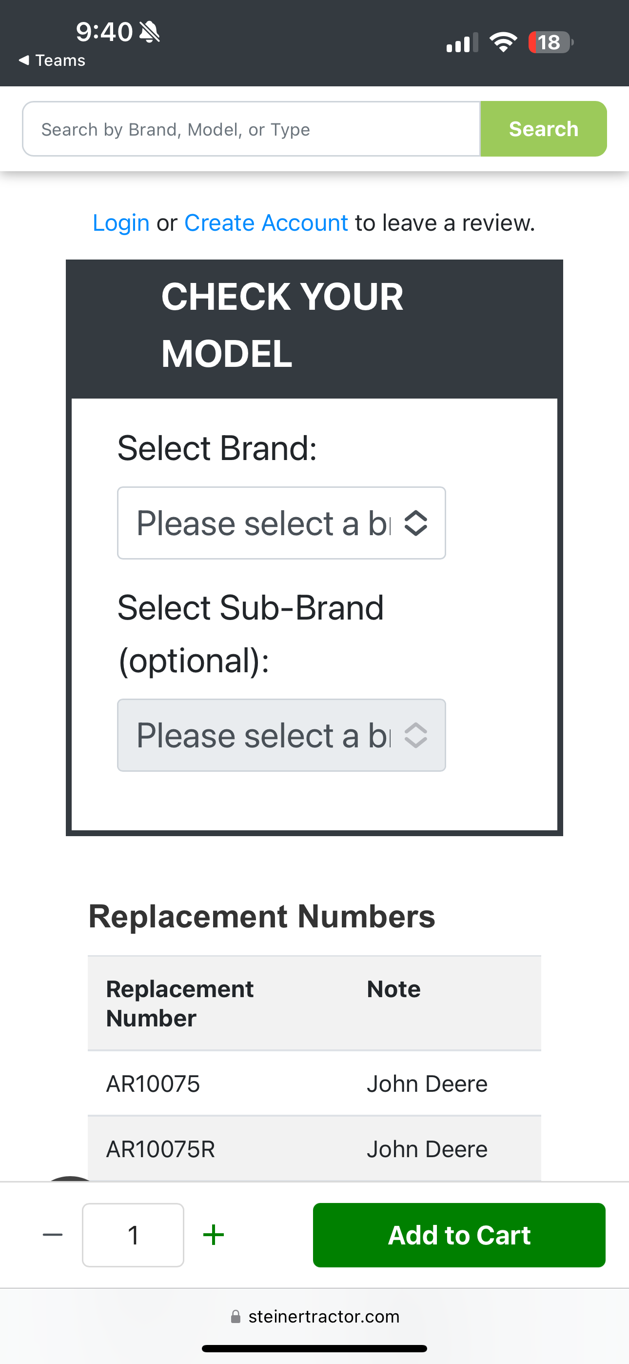
Add "Check Fitment" messaging above the quick add button. Clicking it will direct users to the product page and automatically scroll to the fitment section for easy access.Check Fit Usage
+2%
Transactions
+6%
Revenue
+$231K
Takeaway
Users need reminders to verify part compatibility with their tractor to avoid impulse purchases and prevent ordering the wrong part.Control
Variant
PDP: Check Fit
CRO goes beyond just improving metrics—it’s about understanding user behavior, making data-driven design decisions, and continuously refining the experience. These A/B tests highlight how identifying friction points, experimenting strategically, and iterating with purpose can drive meaningful improvements in eCommerce performance.
Explore Other Projects
Conversion Rate OptimizationEcommerce Growth Through A/B Testing

Problem
Many eCommerce sites lose potential customers due to friction in the user journey—unclear navigation, distracting content, or ineffective page layouts. Even minor UX issues can lead to abandoned carts and lost revenue.Solution
Conversion Rate Optimization (CRO) identifies these pain points through A/B testing, user insights, and data analysis. By making targeted design and functionality improvements, CRO enhances the shopping experience, reduces drop-off rates, and drives measurable revenue growth.
Understanding the impact of CRO is one thing—seeing it in action is another. Below are five real-world A/B tests that showcase the power of strategic experimentation, whether through major wins, valuable learnings from inconclusive tests, or lessons from losses that led to future success.
Sitewide | All DevicesAdd Sticky Email Button
Hypothesis
Replacing the email popup modal with a less intrusive sticky button will reduce user friction, allowing them to engage with the promotional message on their terms.Design
Disable the popup and replace it with a sticky button in the bottom left corner labeled 'Get 20% Off'. When clicked, the button will trigger the email popup.Email Signups
-53%
Transactions
+22%
Revenue
+$1MM
Takeaway
This test demonstrates a trade-off between boosting transactions and reducing email engagement. Prioritizing one over the other is a business decision—this client chose to focus on transactions.Control

Variant

Checkout | All DevicesHighlight 'Best Value' Shipping
Hypothesis
We believe customers often overlook the benefit of faster delivery when free shipping is available. By visually highlighting the best-value shipping option, we aim to draw attention to paid shipping methods and increase their selection.Design
Add a green "Best Value" badge next to the first paid shipping option to draw attention and encourage selection.Transactions
+1%
Paid Shipping
+40%
Revenue
+$120K
Takeaway
Free shipping is often an expected perk for online shoppers, but this test demonstrates that strategically highlighting shipping options can drive greater engagement and influence purchase decisions.Control

Variant

Product Detail Page | All DevicesAdd a Featured Review
Hypothesis
Placing a featured review near the product description will build trust and increase conversions. A ‘Read All Reviews’ button anchors users to the full reviews section.Cart Additions
-4%
Transactions
-6%
Revenue
-5%
Iteration
Insight: Users who clicked ‘Read All Reviews’ were less likely to return and complete their purchase.Solution: Removed the ‘Read All Reviews’ button while keeping the featured review visible.
Cart Additions
0%
Transactions
+1.50%
Revenue
+$98K
Design 1

Design 1 Anchor

Iteration

Google Shopping TrafficSimplify Shopping Experience
Hypothesis
Redesigning the product page for shopping ad traffic will better align with user intent. Replacing lower-page content with a product grid similar to a shopping results page will encourage users to continue browsing onsite instead of returning to Google Search.Design
Remove all content below the add-to-cart button and replace it with a six-row product grid showcasing similar items. Title this section 'You May Also Like'.Cart Additions
+60%
Transactions
+49%
Revenue
+$553K
Takeaway
Users who click on a product ad but find it's not the right fit are open to exploring similar products within the same brand when prompted.Variant

Product Listing Page | All DevicesAdd a 'Check Fit' Label
Hypothesis
Adding clear fitment messaging to product tiles will help users quickly identify compatible tractor parts, encouraging informed clicks and reducing order returns from incompatible parts.Design
Add "Check Fitment" messaging above the quick add button. Clicking it will direct users to the product page and automatically scroll to the fitment section for easy access.Check Fit Usage
+2%
Transactions
+6%
Revenue
+$231K
Takeaway
Users need reminders to verify part compatibility with their tractor to avoid impulse purchases and prevent ordering the wrong part.Control

Variant

PDP: Check Fit

CRO goes beyond just improving metrics—it’s about understanding user behavior, making data-driven design decisions, and continuously refining the experience. These A/B tests highlight how identifying friction points, experimenting strategically, and iterating with purpose can drive meaningful improvements in eCommerce performance.
Conversion Rate OptimizationEcommerce Growth Through A/B Testing

Understanding the impact of CRO is one thing—seeing it in action is another. Below are five real-world A/B tests that showcase the power of strategic experimentation, whether through major wins, valuable learnings from inconclusive tests, or lessons from losses that led to future success.
Problem
Many eCommerce sites lose potential customers due to friction in the user journey—unclear navigation, distracting content, or ineffective page layouts. Even minor UX issues can lead to abandoned carts and lost revenue.Solution
Conversion Rate Optimization (CRO) identifies these pain points through A/B testing, user insights, and data analysis. By making targeted design and functionality improvements, CRO enhances the shopping experience, reduces drop-off rates, and drives measurable revenue growth.
Sitewide | All DevicesAdd Sticky Email Button
Hypothesis
Replacing the email popup modal with a less intrusive sticky button will reduce user friction, allowing them to engage with the promotional message on their terms.Design
Disable the popup and replace it with a sticky button in the bottom left corner labeled 'Get 20% Off'. When clicked, the button will trigger the email popup.Email Signups
-53%
Transactions
+22%
Revenue
+$1MM
Takeaway
This test demonstrates a trade-off between boosting transactions and reducing email engagement. Prioritizing one over the other is a business decision—this client chose to focus on transactions.Control

Variant

Checkout | All DevicesHighlight 'Best Value' Shipping
Hypothesis
We believe customers often overlook the benefit of faster delivery when free shipping is available. By visually highlighting the best-value shipping option, we aim to draw attention to paid shipping methods and increase their selection.Design
Add a green "Best Value" badge next to the first paid shipping option to draw attention and encourage selection.Transactions
+1%
Paid Shipping
+40%
Revenue
+$120K
Takeaway
Free shipping is often an expected perk for online shoppers, but this test demonstrates that strategically highlighting shipping options can drive greater engagement and influence purchase decisions.Control

Variant

Product Detail Page | All DevicesAdd a Featured Review
Hypothesis
Placing a featured review near the product description will build trust and increase conversions. A ‘Read All Reviews’ button anchors users to the full reviews section.Cart Additions
-4%
Transactions
-6%
Revenue
-5%
Iteration
Insight: Users who clicked ‘Read All Reviews’ were less likely to return and complete their purchase.Solution: Removed the ‘Read All Reviews’ button while keeping the featured review visible.
Cart Additions
0%
Transactions
+1.50%
Revenue
+$98K
Design 1

Design 1 Anchor

Iteration

Google Shopping TrafficSimplify Shopping Experience
Hypothesis
Redesigning the product page for shopping ad traffic will better align with user intent. Replacing lower-page content with a product grid similar to a shopping results page will encourage users to continue browsing onsite instead of returning to Google Search.Design
Remove all content below the add-to-cart button and replace it with a six-row product grid showcasing similar items. Title this section 'You May Also Like'.Cart Additions
+60%
Transactions
+49%
Revenue
+$553K
Takeaway
Users who click on a product ad but find it's not the right fit are open to exploring similar products within the same brand when prompted.Variant

Product Listing Page | All DevicesAdd a 'Check Fit' Label
Hypothesis
Adding clear fitment messaging to product tiles will help users quickly identify compatible tractor parts, encouraging informed clicks and reducing order returns from incompatible parts.Design
Add "Check Fitment" messaging above the quick add button. Clicking it will direct users to the product page and automatically scroll to the fitment section for easy access.Check Fit Usage
+2%
Transactions
+6%
Revenue
+$231K
Takeaway
Users need reminders to verify part compatibility with their tractor to avoid impulse purchases and prevent ordering the wrong part.Control

Variant

PDP: Check Fit

CRO goes beyond just improving metrics—it’s about understanding user behavior, making data-driven design decisions, and continuously refining the experience. These A/B tests highlight how identifying friction points, experimenting strategically, and iterating with purpose can drive meaningful improvements in eCommerce performance.

